Planning: Title Design
- Get link
- X
- Other Apps
My partner and I, Nicholas Arnold, spent a lot of time deliberating what kind of title we wanted to use and what the title would actually be. We also put much thought into how we could incorporate it into the movie opening. Our movie's genre is primarily horror. But, it also has mystery elements in it. The mystery comes from the plot point in which the murderer is unknown and could be among the group.
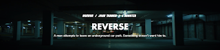
Title we cam up with was "Among Them". We came to this idea because of the hidden imposter among the group of friends. We discussed different titles such as "among us". However, we decided against that title idea because we considered it too cliché.
[6:49 PM]
The hardest part of making a title was thinking up the font, font size, and color. The best font we found was a font called "Friday 13". It is a font similar to that of the popular horror movie series "Friday the 13th". It's a good match to our project because our movie is horror, just like the Friday the 13th franchise. Regarding the font size, we plan to use at least two different font sizes. We plan to use one size that is comparatively smaller for the credits. On the other hand, the font size we plan to use for the actual title card is going to be comparatively much larger. For the color, we initially wanted to use something dark. However, we plan to film part of the opening in the dark. So, using a dark font would blend the title into the background. To solve this, we decided to use red text on a black bubble-like background. The dark font and red coloring will make the audience feel fearful and anxious, which matches our genre. For the integration of the title, we decided to put the credits in the background of the opening scenes and the big title at the end, after the dead body is reported.

- Get link
- X
- Other Apps


Comments
Post a Comment